
I am a great fan of charts, I really believe that a picture can be worth a thousand words. A good chart can convey a lot of information in a simple and easily digestable form. The most important thing is that the charts should be useful; but a lot of the charts you see on websites are just ugly.
I wanted to create some charts that wouldn't look out of place if they were printed in a magazine. Looking around I found a few libaries but none of them had the look I was after (partly because I didn't really know what I was after). This was just really a fun project personal project so I wasn't limited by anything other than myself.
I decided to see what I could come up with, and knowing I wanted some nice looking graphics decided to choose three.js to render my charts. This would be I could (hopefully) have some nice looking charts with some realistic materials.
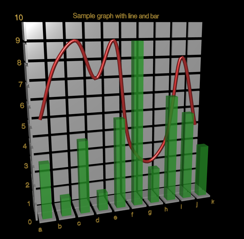
After some playing this is what I came up with, the chart is a 3d object that can be rendered at any angle or size, which can make for some interesting effects, there is a simple helper library for adding data to the chart object.
I'm quite pleased with the look, and the interface is pretty easy to use, although it needs some tweaking.
You can see the full source here.